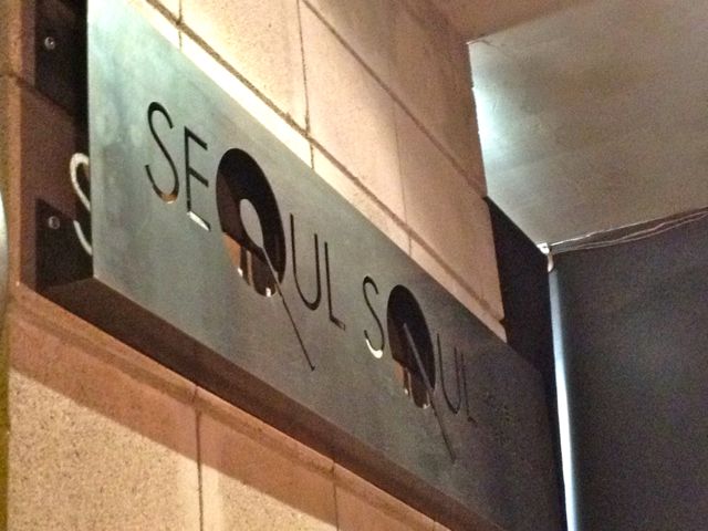
Oooh, I really like that sign. I like how it juts out from the wall and adds some dimensionality through shadows and space. I am also really curious how they cut out the spoon handle in the “O” but were able to leave the spoon face as the center. Great design. It makes me hungry.


Oooh, I really like that sign. I like how it juts out from the wall and adds some dimensionality through shadows and space. I am also really curious how they cut out the spoon handle in the “O” but were able to leave the spoon face as the center. Great design. It makes me hungry.